Colour maps and FSLeyes - more than just aesthetics
Data visualization is a crucial part of neuroimaging research, where we - quite literally - generate images of the brain. The famous ‘blobs’ of functional MRI are real eye-catchers, though sometimes criticised, and a whole-brain connectome of the human brain even made it onto the cover of a Muse album. As a researcher, we aim to portrays dense and complex information in graphical form that allows the reader to assess an effect with a single look. But just like data processing, data visualization requires careful considerations to prevent biases and mislead interpretations. One aspect that doesn’t get much attention, but which can lead to misinformation and artefacts, is the choice of colour maps. As an example case, I show below three random spatially smoothed brain masks, but the same thoughts apply to the visualization of statistical images from fMRI, tractography results, overlap maps in stroke research, etc.
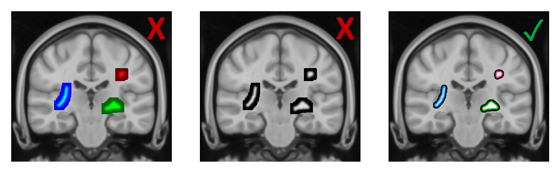
In order to be able to visually compare the intensity values in the three masks, the first choice might be to pick three different colour maps that are automatically provided by the image viewer FSLeyes - here blue, red and green. Although higher values consistently show up in a lighter colour, it’s not possible to assess the relative differences. The underlying problem is three-fold: The colours are not matched in luminance, the colour maps are not linear and not matched in luminance profile and the range of displayed intensities is not consistent. One solution might be to pick a grey-scale colour map, where the luminance linearly increases from 0 (black) to 1 (white), but obviously this choice is not ideal if color mapping is required.
The last example in the figure above shows a visualization that I would prefer for several reasons: The three colours are clearly separable, the colour maps increase linearly from 0 to 1 with the colour at the midpoint having the exact luminance of 0.5 and the intensity ranges have a matched upper and lower threshold. Luckily, the new version of FSLeyes is based on Python, which allows you to control your visualization using customized scripts and tools from the entire Python ecosystem. Below I will detail some of the luminance issues in colourmaps and give an example of how to set your custom colour map in FSLeyes. All of the code here and other useful functions to work with colour maps can be found in a module in my GitHub repository.
Why luminance matters in colour maps
There are physical and psychopysical differences between luminance, perceived luminance, luminousity, brightness, etc. but for my purposes I found it sufficient to quantify perceived luminance based on the red-green-blue (RGB) code of a colour. Again, there are different ways to compute this value, but I used the following equation:
luminance = red * 0.2126 + green * 0.7152 + blue * 0.0722
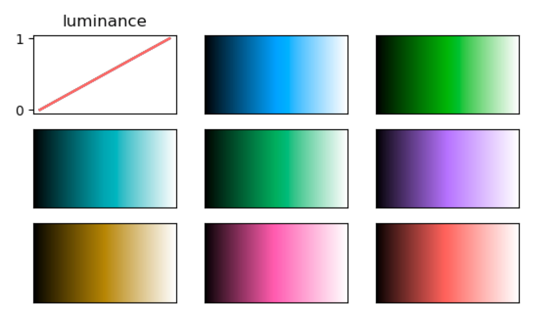
If we pick colours based on names that are, for example, pre-defined in MATLAB or matplotlib, they are usually not matched in luminance. We can visualize this by generating a linear colour map that has as certain colour as midpoint and plot associated luminance profile. The figure below is loosely based on the following code pieces for the colours ‘grey’, ‘lightskyblue’, ‘gold’, ‘red’, ‘forestgreen’, ‘fuchsia’, ‘lime’ and ‘mediumblue’:
import numpy as np
import matplotlib.pyplot as plt
from matplotlib.colors import LinearSegmentedColormap


def get_luminance(colour, luminance_factors={'R': 0.2126, 'G': 0.7152, 'B': 0.0722}):
    '''determine the perceived luminance value for a rgb colour'''
    L = luminance_factors['R'] * colour[0] + luminance_factors['G'] * colour[1] + luminance_factors['B'] * colour[2]
    return L


# generate a colour map, here for 'forestgreen'
colour_map = LinearSegmentedColormap.from_list('mycmap', ['black', 'forestgreen', 'white'])

# generate a patch to visualize the colour map
gradient = np.linspace(0, 1, 256)
gradient_2 = np.vstack((gradient, gradient))
plt.imshow(gradient_2, aspect='auto', cmap=colour_map)

# plot the luminance profile of the colour map
cmap_arr = colour_map(gradient)
L = np.apply_along_axis(get_luminance, 1, cmap_arr)
plt.plot(gradient, L, color=cmap_arr[np.int(np.floor(len(cmap_arr) / 2))])
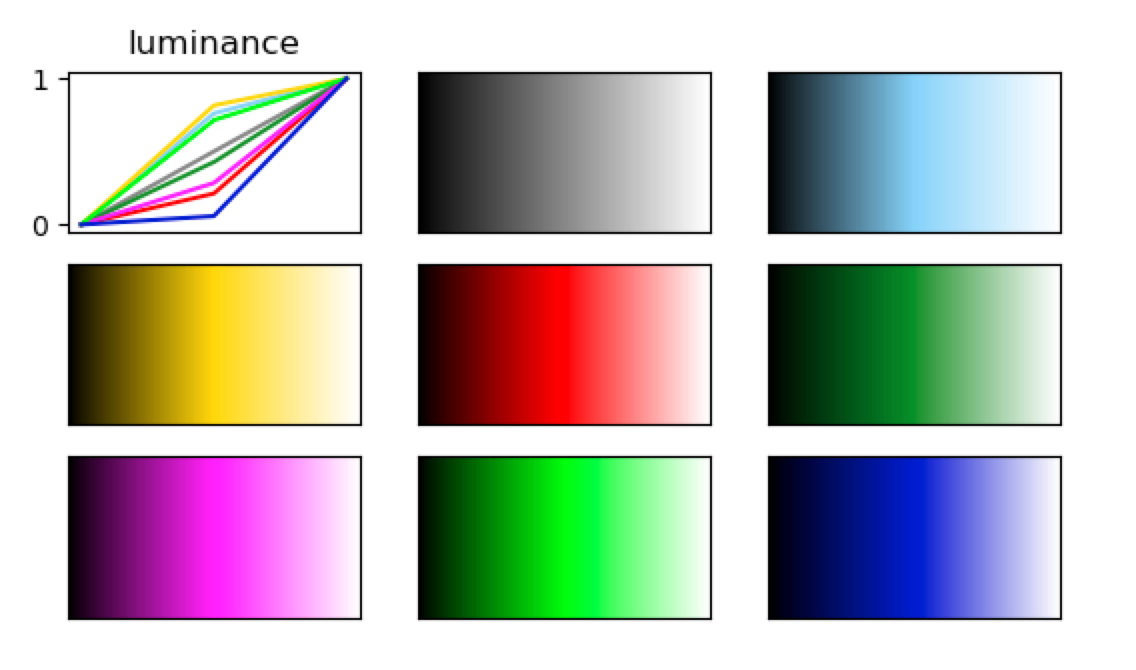
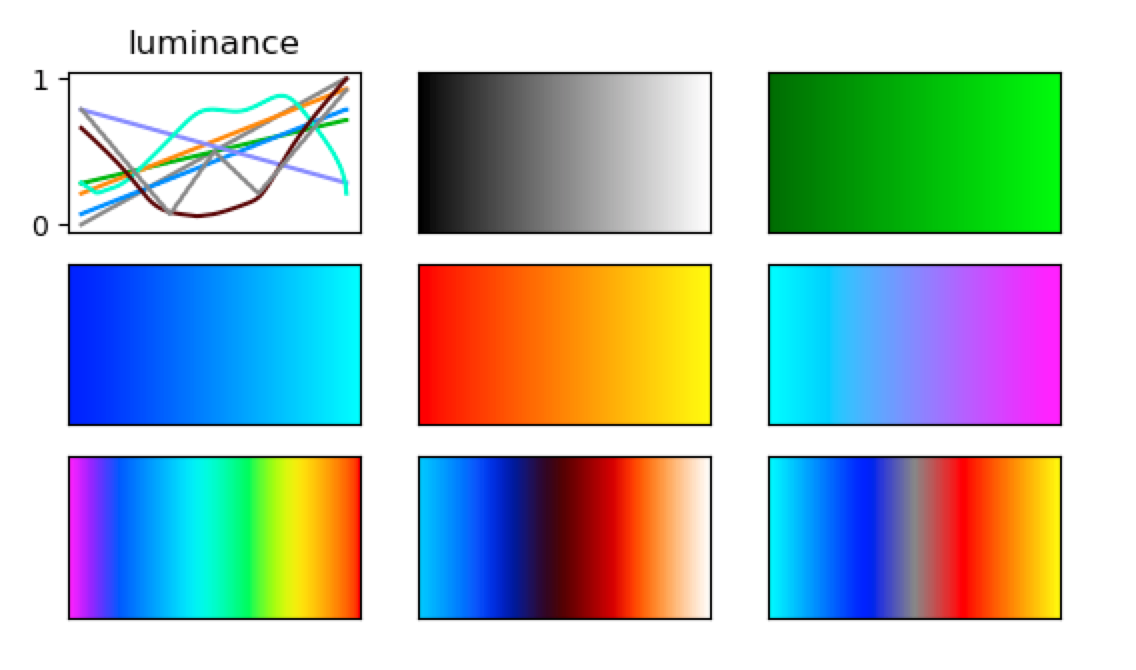
It becomes apparent that the midpoints of the colour maps differ in their luminance, which can introduce perceptual artefacts despite the fact that all maps range from black to white. This effect becomes much more evident, when we use pre-defined colour maps that come with the image viewer. Some of the default maps have been designed for very different purposes, but it’s worth thinking about if luminance should be controlled for in your display. In FSLeyes, the default colour maps can be accessed at FSLeyes.app/Contents/Resources/assets/colourmaps/. In the figure below I plot the luminance profiles for a selection of default colour maps. Within your Python code, you can access them as follows:
import fsleyes

# get a list of all default maps
fsleyes.colourmaps.scanColourMaps()

# get 'cool' as example colour map
colour_map = fsleyes.colourmaps.getColourMap('cool')
Matching luminance
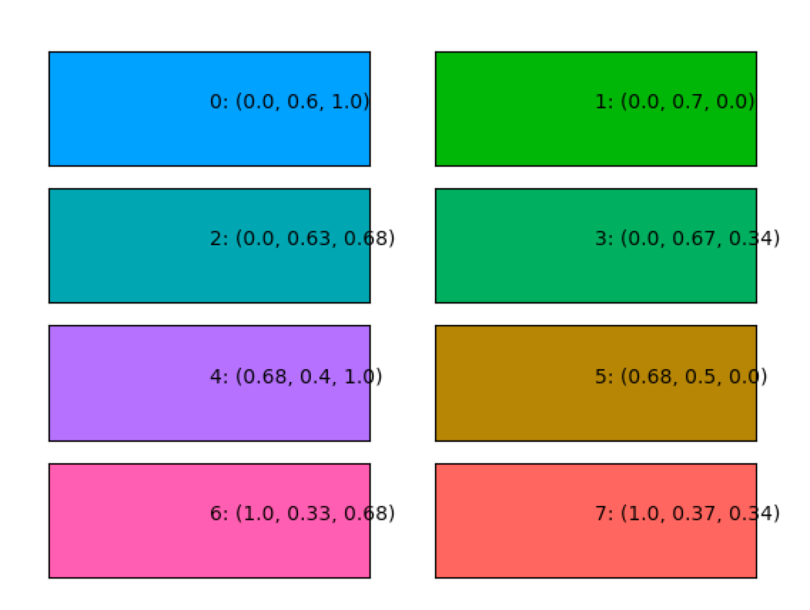
For the above mentioned considerations, I wrote a piece of code that generates colours at a given luminance level. Here is a selection of 8 colours at a luminance level of 0.5 plotted together with their RGB code. If we plot the luminance profiles of the colour maps, they all have the same linear pattern which creates a smooth gradient.
Custom colour maps in FSLeyes
As mentioned above, we can use these Python snippets to define colour maps in FSLeyes. A custom script can be loaded from the GUI or pasted in the Python shell. Here is some code that I used to create the figure at the very top:
import sys
import os
import numpy as np
from matplotlib.colors import LinearSegmentedColormap
import sys
# my package, wich can be found on GitHub:
from my import luminance

# load overlays
load(os.path.join(FSLDIR, 'data', 'standard', 'MNI152_T1_0.5mm.nii.gz'))
load('mask1.nii.gz'))
load('mask2.nii.gz'))
load('mask3.nii.gz'))

# determine display range
my_max = 0
my_min = 0
for overlay in overlayList:
    if 'mask' in overlay.name:
        if np.max(overlay.data) > my_max:
            my_max = np.max(overlay.data)
        if np.min(overlayList[0].data) < my_min:
            my_min = np.min(overlay.data)

range = my_max - my_min
displayRange = np.array([my_min + range * 0.01, my_max])

# generate a selection of colours of luminance 0.5
colours_list = luminance.isoluminance_colours(L=0.5, n_colours=4, min_diff_col=0.6, verbose=0)
selection = colours_list[[0, 1, 3], :]

# set colour map and display range for masks
ind = 0
for overlay in overlayList:
    if 'range' in overlay.name:
        cmap = LinearSegmentedColormap.from_list('mycmap', ['black', selection[ind, :], 'white'])
        displayCtx.getOpts(overlay).cmap = cmap
        displayCtx.getOpts(overlay).clippingRange = displayRange
        displayCtx.getOpts(overlay).displayRange = displayRange
        ind = ind + 1

# generate a legend that shows the gradient of the colour map
fig, ax = plt.subplots(len(selection), figsize=(6, 4), subplot_kw=dict(xticks=[], yticks=[]))
gradient = np.linspace(0, 1, 256)
gradient = np.vstack((gradient, gradient))
for ind, colour in enumerate(selection):
    cmap = LinearSegmentedColormap.from_list('mycmap', ['black', colour, 'white'])
    ax[ind].imshow(gradient, aspect='auto', cmap=cmap)
    ax[ind].axis('off')
print(displayRange)
fig.subplots_adjust(hspace=0)
plt.show()
That’s it!
Spending some time to think about colour maps will not only make the display visually more appealing, but it can actually improve the scientific quality of your figure. The FSLeyes Python API gives you all the freedom to customize and automatize the display, and offers many other features that are worth looking at. I hope this description gave you some inspiration for improving your results figures.
Thanks for reading this post :-)
Nicole