From spiders and sliders and seaborn: Useful plotting options in Python
Data visualization plays a key role in quantitative research and as the saying goes ‘a picture speaks a thousand words’. For any step from raw data to final results figure, we continuously need to assess the quality of our data and check if our manipulations and computations do what we expect them to do. Unfortunately, you often might find yourself tinkering around for hours with x-ticks and subplot positions or even making a sloppy mistake in the axis labels, which could lead to completely misleading conclusions. That’s why it’s indispensable to know how to use plotting tools that are quick, flexible and reliable.
Here, I want to talk you through four examples of plots that I keep reusing for different purposes, and you can find all the code shown here in my GitHub repository.
1) Seaborn’s catplot
Seaborn is a data visualization library that is based on matplotlib and it truly stands out by its simplicity to use. Check out their web gallery to have a look at the variety of plots that can be generated with just a few lines of code. Since I discovered how well Python’s pandas data structure and seaborn work together, I convert my data to a DataFrame whenever possible. Seaborn’s catplot is a great tool for showing the relationship of a continuous variable to different categorical factors with multiple levels. The simulated data in the example below could be the result of a brain stimulation experiment, where we measured the strength of a resting-state network in both hemispheres, within multiple regions of the brain, before and after brain stimulation.
In the overhead section, I hard-coded the factors and levels as lists, but you might consider reading in your particpant ID from a participants.tsv file, as I described in my post about BIDS.
import numpy as np
import os
import matplotlib.pyplot as plt
import pandas as pd
import seaborn as sns

# --------
# overhead
# --------
rootdir = 'my/path/somewhere/'
subs = ['01', '02', '03', '04', '05', '06', '07', '08', '09', '10']
ROI_list = ['ROI1', 'ROI2', 'ROI3', 'ROI4']
condition_list = ['pre', 'post']
hemi_list = ["L", "R"]
In the next section I read in the data into a pandas DataFrame using loops, so that each measurement occupies a row. In case your DataFrame has been set up in a different way, you can use pandas’s reshaping methods such as melt un-/stack or pivot to bring it, well, in shape.
# --------
# read data into DataFrame
# --------
df = pd.DataFrame(columns=["subj", "ROI", "hemi", "condition", "my_value"])
my_row = 0
for sub in subs:
    # location of subject's derived data according to BIDS format
    OD = os.path.join('rootdir', 'derivatives', 'sub-' + sub)
    for ind_r, ROI in enumerate(ROI_list):
        for hemi in hemi_list:
            for ind_c, cond in enumerate(condition_list):
                # generate random value here as example
                my_val = my_val = np.random.uniform(0, 10) + ind_r + ind_c
                df.loc[my_row] = [sub, ROI, hemi, cond, my_val]
                my_row = my_row + 1
For the actual plotting command, you only need a single line! Here, I chose a boxen plot, but just by changing the ‘kind’ option the display can be converted to a violinplot, pointplot, etc.
# --------
# plotting using seaborn
# --------
sns.catplot(x="ROI", y="my_value", data=df, dodge=True, hue='condition', col='hemi', kind='boxen')
plt.show()
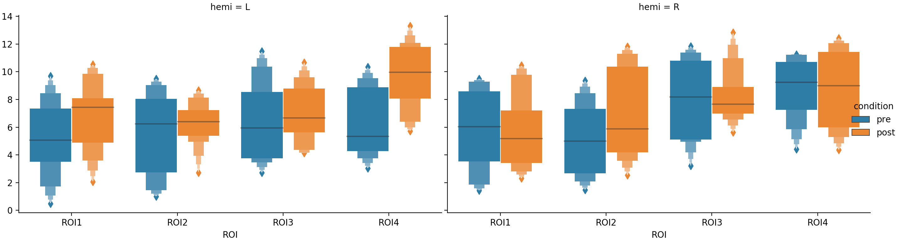
There are certainly many ways to improve the look of this plot, but I wanted to demonstrate that even the minimal set of inputs to the plotting command produces a clear and informative visualization of the data.
2) Spider plot in matplotlib
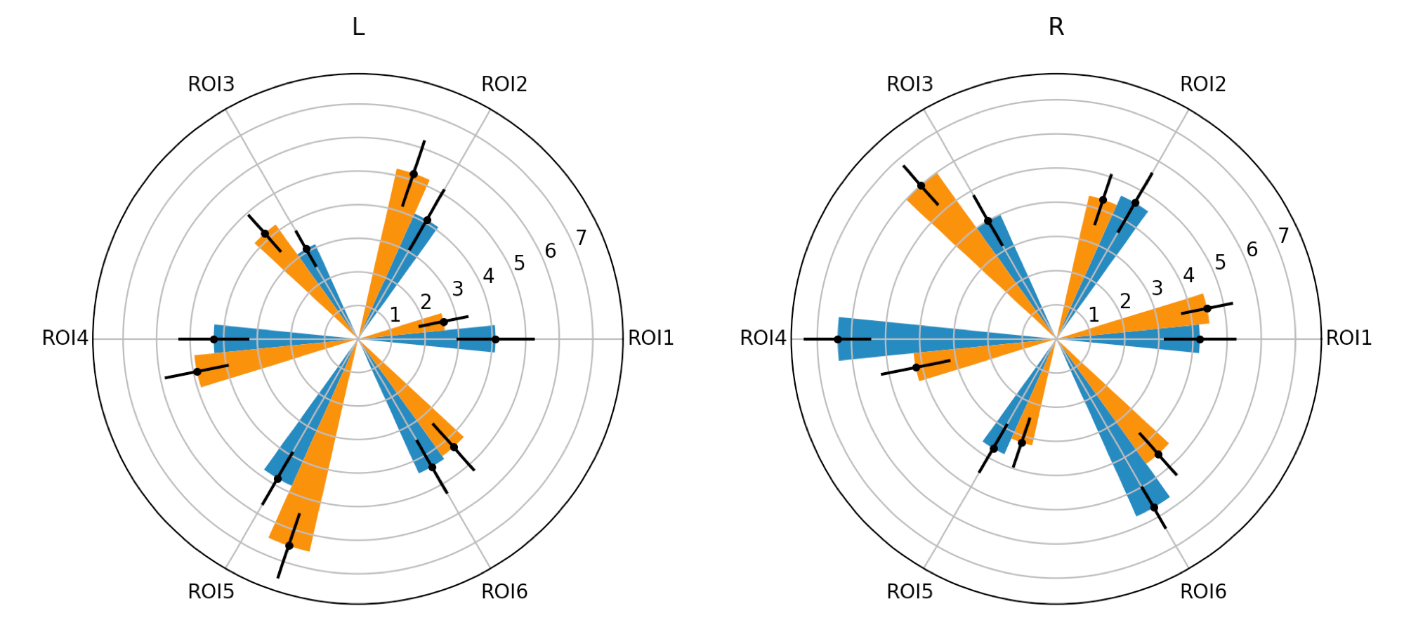
Spider (or web/polar/radar) plots show data on multiple axis that all originate from one point. In neuroscience, spider plots can be used, for example, to visualize a brain area’s ‘connectional fingerprint’1. On each axis we plot the strength of connection between a brain area (or a white matter tract) with other regions of interest. The example below could be from an analysis, where we are comparing the connectivity profiles of two white matter tracts.
import numpy as np
import os
import matplotlib.pyplot as plt
import pandas as pd

# --------
# overhead
# --------
rootdir = 'my/path/somewhere/'
subs = ['01', '02', '03', '04', '05', '06', '07', '08', '09', '10']
tract_list = ['tract1', 'tract2']
ROI_list = ['ROI1', 'ROI2', 'ROI3', 'ROI4', 'ROI5', 'ROI6']
hemi_list = ['L', 'R']

# --------
# read data into dataframe
# --------
df = pd.DataFrame(columns=["subj", "ROI", "tract", "hemi", "my_value"])
my_row = 0
for sub in subs:
    OD = os.path.join('rootdir', 'derivatives', 'sub-' + sub)
    for ROI in ROI_list:
        for tract in tract_list:
            for hemi in hemi_list:
                # generate random value here as example
                my_val = np.random.randint(10)
                df.loc[my_row] = [sub, ROI, tract, hemi, my_val]
                my_row = my_row + 1

# make 'my_value' column explicitly numeric to allow for groupby operation below
df.my_value = pd.to_numeric(df.my_value)
It’s possible to use seaborn to make a spider plot, but it requires passing down arguments to the underlying matplotlib objects, which I find quite unintuitive and I’d rather use matplotlib directly. The plotting command requires a few lines of code and we have to generate errorbars manually, but this snipped can be easily adapted for all sorts of spider plots.
# --------
# plotting
# --------
# make equally spaced angles for each of the ROIs
sections = np.linspace(0.0, 2 * np.pi, len(df.ROI.unique()), endpoint=False)
# width of bars
width = 0.2
for he, hemi in enumerate(hemi_list):
    ax = plt.subplot(1, 2, he + 1, projection='polar')
    for tr, tract in enumerate(tract_list):
        # compute means
        my_means = df[(df.hemi == hemi) & (df.tract == tract)].groupby('ROI').my_value.mean().values
        # compute standard error of the mean for error bars
        my_errs = df[(df.hemi == hemi) & (df.tract == tract)].groupby('ROI').my_value.std().values / np.sqrt(len(subs))
        # move (error-)bars of the second tract one bar width along the circle
        # so that both bar types are visible next to each other
        bars = ax.bar(sections + tr * width, my_means, width=width, bottom=0.0)
        err_bars = ax.errorbar(sections + tr * width, my_means, my_errs, fmt='.', c='black')
    ax.set_title(hemi)
    ax.set_xticks(sections)
    ax.set_xticklabels(ROI_list)
plt.show()
3) Interactive slider
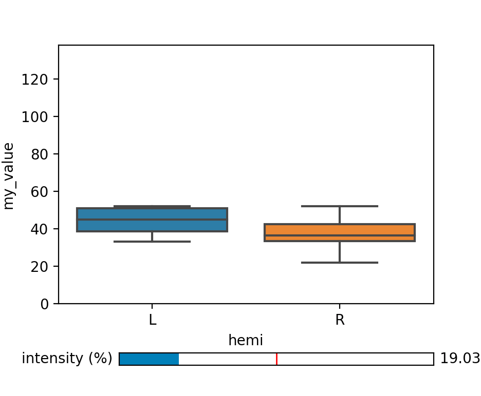
In the examples above we plotted a continuous variable with respect to categorical factors. If you have an additional continuous factor as explanatory variable, however, it might not be possible to plot all factors alongside. In this case, you can use a slider to ‘move along’ an additional dimension to explore your data. The example below could be a from a study, where we measured the power of the MEG signal in a certain frequency band in both hemispheres under varying light intensities.
import os
import numpy as np
import matplotlib.pyplot as plt
from matplotlib.widgets import Slider
import pandas as pd
import seaborn as sns

# --------
# overhead
# --------
rootdir = 'my/path/somewhere/'
subs = ['01', '02', '03', '04', '05', '06', '07', '08', '09', '10']
intensity_list = np.arange(0, 101)
hemi_list = ["L", "R"]

# --------
# read data into dataframe
# --------
df = pd.DataFrame(columns=["subj", "hemi", "intensity", "my_value"])
my_row = 0
for sub in subs:
    OD = os.path.join('rootdir', 'derivatives', 'sub-' + sub)
    for hemi in hemi_list:
        for intensity in intensity_list:
            # use random value here as example
            my_val = np.random.randint(40) + intensity
            df.loc[my_row] = [sub, hemi, intensity, my_val]
            my_row = my_row + 1
We set up the figure with a subplot for the actual plot and the matplotlib widget ‘slider’ initialized with a certain value.
# initialize matplotlib figure
fig, ax = plt.subplots(figsize=(4, 4))
# adjust the subplots region to leave some space for the sliders and buttons
fig.subplots_adjust(bottom=0.25)
# define an axes area and draw a slider in it
my_slider_ax = fig.add_axes([0.25, 0.1, 0.65, 0.03])
# intensity level chosen for initialization
intensity_init = 50
# generate slider with initial value
my_slider = Slider(my_slider_ax, 'intensity (%)', 0, 100, valinit=intensity_init)
Next, we define a function that will be executed when the slider value is changed and link it to the slider widget.
# define an action for when the slider's value changes
def slider_action(val):
    # the figure is updated when the slider is changed
    update_plot(np.round(val))


# link slider_action function to slider object
my_slider.on_changed(slider_action)
I defined a function of how to update the plot, which requires clearing the figure axis and re-drawing the figure. For other types of plots there are re-drawing functions that don’t require you to clear the figure, which is more efficient.
# define how to update the plot
def update_plot(intensity):
    # clear the axis before the plot is redrawn
    ax.clear()
    sns.boxplot(x="hemi", y="my_value", data=df[df.intensity == intensity], ax=ax)
    # keep the axis limits constant for better visibility of the changes
    ax.set_ylim(0, np.max(df.my_value.values))
    # update figure
    fig.canvas.draw_idle()
At the end of the script, we call the ‘update_plot’ function to draw the initial plot and display the figure.
# draw initial plot with default intensity
update_plot(intensity_init)
# display figure
plt.show()
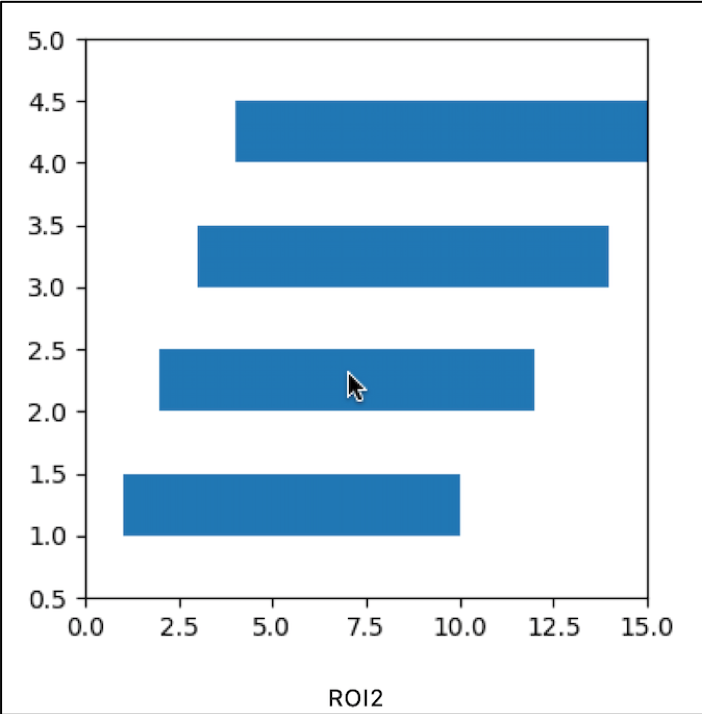
4) Embedding plots in a GUI
If you like the interactive character of the plot above, you might even want to go a step further and embed your plot within a Graphical Use Interface (GUI). Tkinter is a commonly used framework for GUI development in Python, which comes with many functionalities for user interaction. Below I show an example, where the user can interact directly with the objects drawn in the plot. In another example, which you can find in my GitHub repository, I generated a time frame and linked a mouse click to scraping the web to display an image within the GUI.
import tkinter as tk
import os
import pandas as pd
import matplotlib.pyplot as plt
import matplotlib.patches as patches
from matplotlib.backends.backend_tkagg import FigureCanvasTkAgg
import numpy as np

# --------
# overhead
# --------
rootdir = 'my/path/somewhere/'
subs = ['01', '02', '03', '04', '05', '06', '07', '08', '09', '10']
ROI_list = ['ROI1', 'ROI2', 'ROI3', 'ROI4']
hemi_list = ["L", "R"]

# --------
# read data into dataframe
# --------
df = pd.DataFrame(columns=["subj", "ROI", "hemi", "my_value"])
my_row = 0
for sub in subs:
    OD = os.path.join('rootdir', 'derivatives', 'sub-' + sub)
    for ind_r, ROI in enumerate(ROI_list):
        for hemi in hemi_list:
            # generate random value here as example
            my_val = np.random.randint(10) + ind_r
            df.loc[my_row] = [sub, ROI, hemi, my_val]
            my_row = my_row + 1
Note that we need to initialize the tkinter widget before we define the plot.
# --------
# Set up TK-widget
# --------
root = tk.Tk()
root.wm_title("Matplotlib embedded in Tkinter")
Here comes the plotting part, where you need to create a handle for the figure (here: fig). In this example I’m drawing multiple (quite meaningless) rectangles, which I store in a list so that we can refer to them later.
# --------
# plotting
# --------
# initialize matplotlib figure
fig, ax = plt.subplots(figsize=(4, 4))
# generate mutliple patches from data
my_patches = []
for ind_r, ROI in enumerate(ROI_list):
    # get a rectangle reaching from lowest to highest value for each ROI
    rect = patches.Rectangle((np.min(df[(df.hemi == "L") & (df.ROI == ROI)].my_value.values) + 1, ind_r + 1), np.max(df[(df.hemi == "L") & (df.ROI == ROI)].my_value.values), 0.5)
    ax.add_patch(rect)
    my_patches.append(rect)

# hard-code axis limits for better visibility
ax.set_xlim(0, 15)
ax.set_ylim(0.5, len(ROI_list) + 1)
In the next section I’m linking the matplotlib figure to the tkinter widget.
# link figure to tkinter
canvas = FigureCanvasTkAgg(fig, master=root)
canvas.draw()
canvas.get_tk_widget().pack()
In this example I want to display the label of the ROI a user clicks on in a text label below the plot. This is how I initialize the text label in the widget:
# define settings for text lable below figure
output_val = tk.StringVar()
output_lbl = tk.Label(textvariable=output_val).pack()
output_val.set("")
Next, I define the action that happens when the mouse is clicked. Other user actions that could be captured are, for example, mouseover or a key press. This function is then linked to the figure canvas.
# define what happens when the figure is clicked
def mouse_click(event):
    # find the ROI associated with the selected patch
    for ROI, patch in zip(ROI_list, my_patches):
        if patch.contains(event)[0]:
            # update the text in the label
            output_val.set(ROI)
            return

# link mouse_click function to figure
canvas.mpl_connect('button_press_event', mouse_click)
As a last line we need to execute the widget, so that GUI is visible when the script is called from the command line. While the mainloop is running, python halts and checks for user input.
# execute widget
tk.mainloop()
That’s it!
There are myriads of plotting functions, options and tools out there which keep changing and evolving. The above examples were quite useful for my everyday work and hopefully they gave you some ideas about how to read in your data and how to plot it.
Thanks for reading this post :-)
Nicole
References
1 Passingham RE, Stephan KE, Kotter R. 2002. The anatomical basis of functional localization in the cortex. Nat Rev Neurosci 3:606–16.